
Services:
Art Direction
Graphic Design
Events & Experiential
Retail Design
Branding
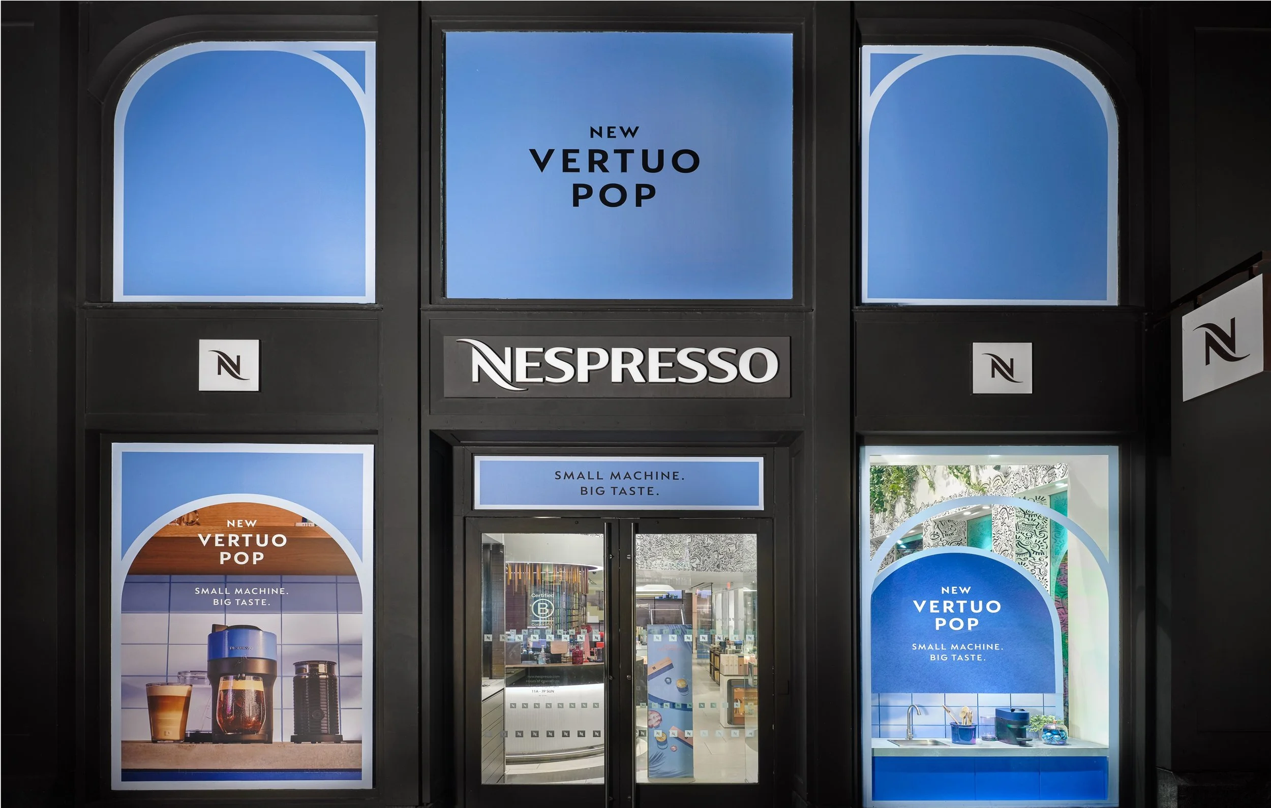
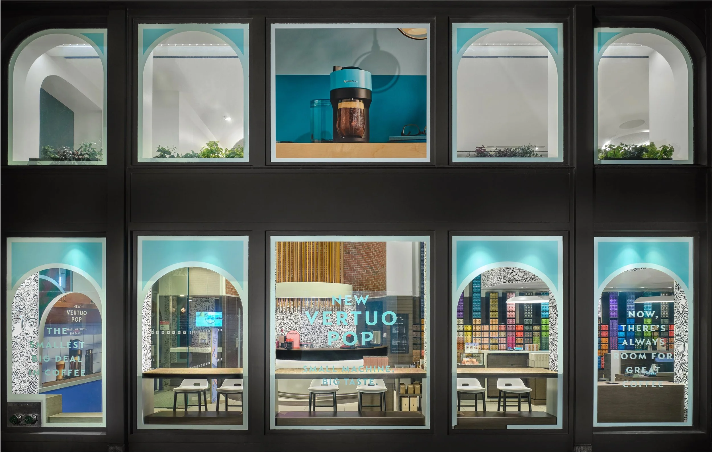
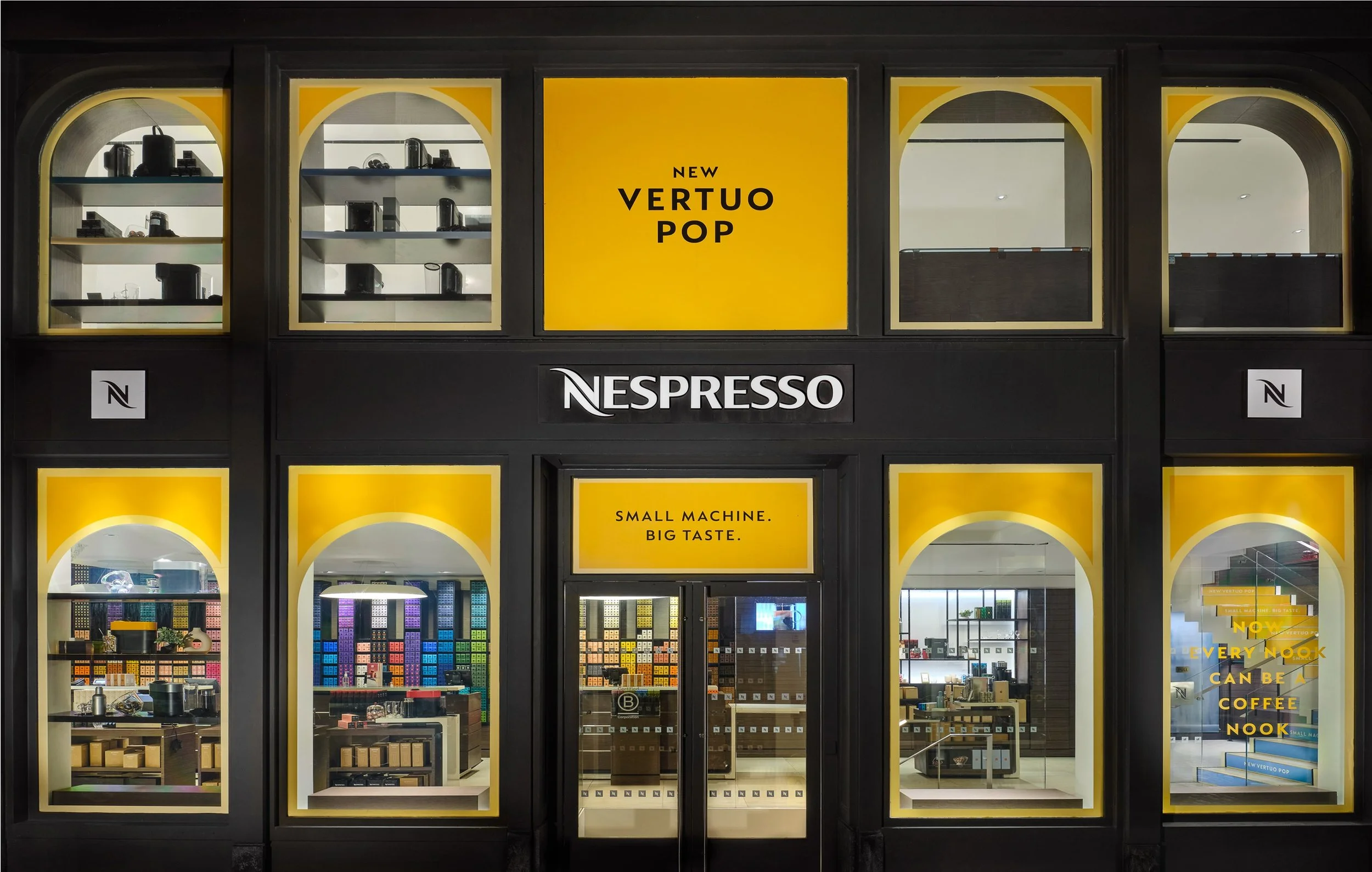
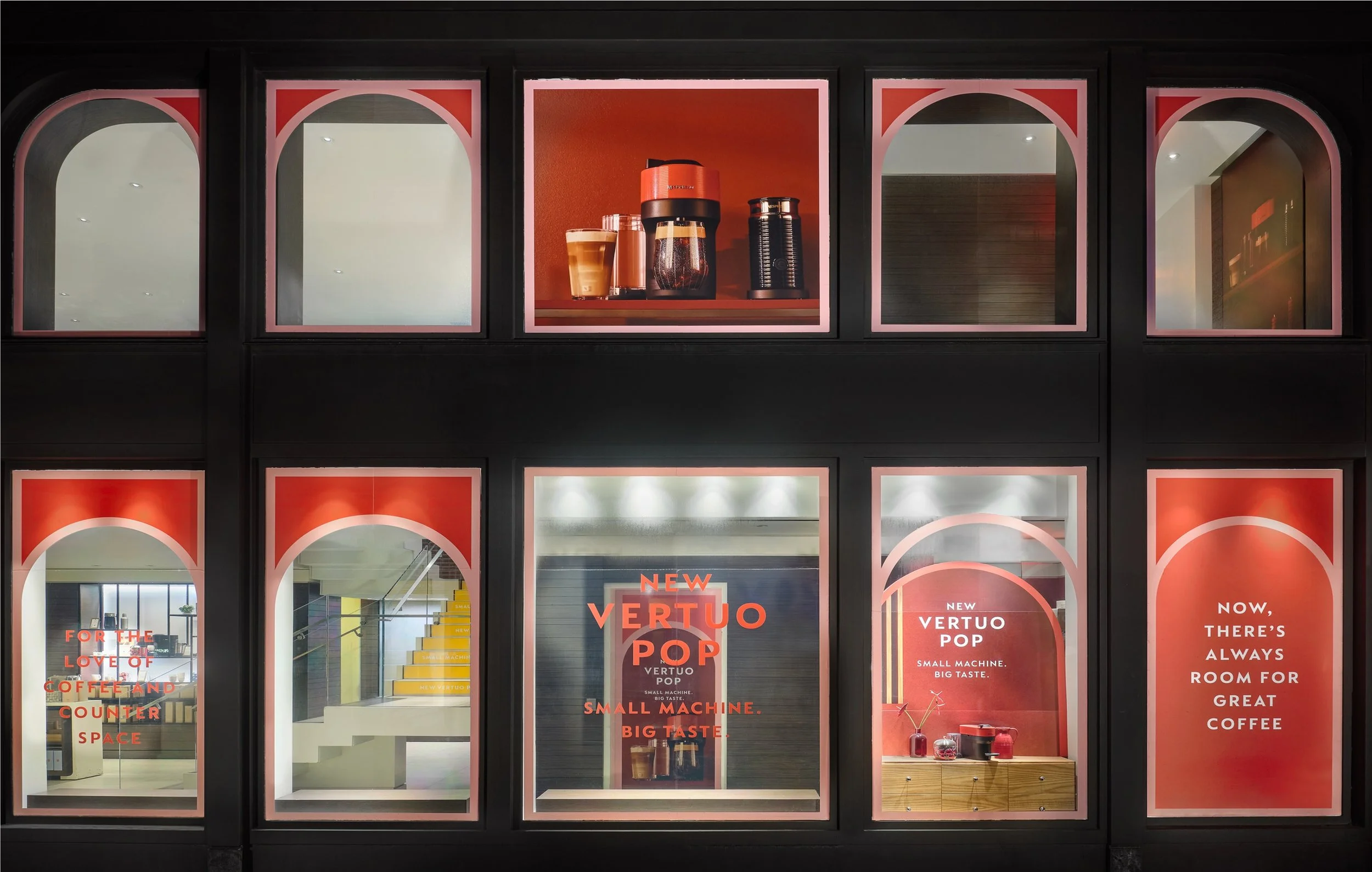
Nespresso
Vertuo Pop Windows
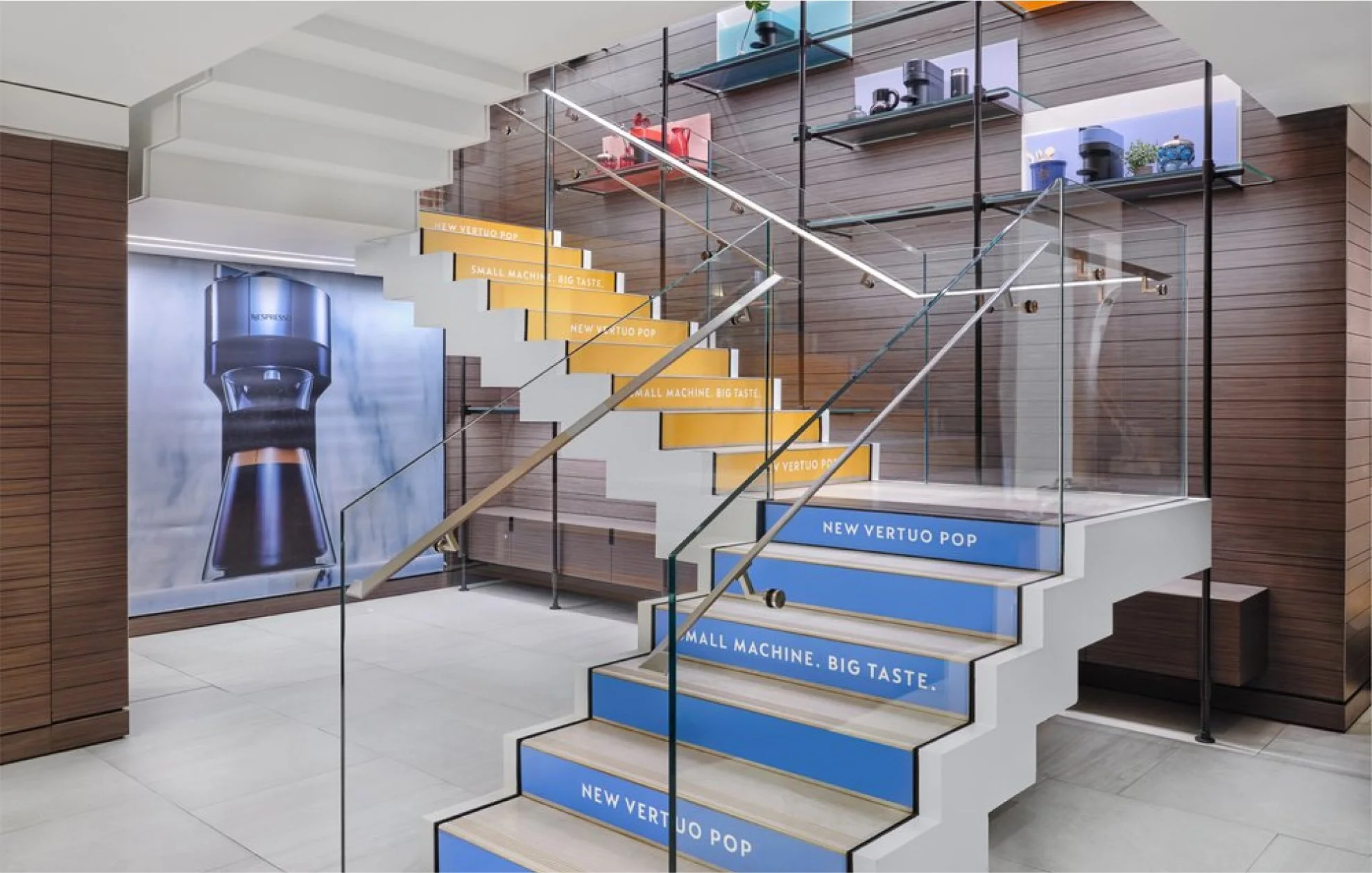
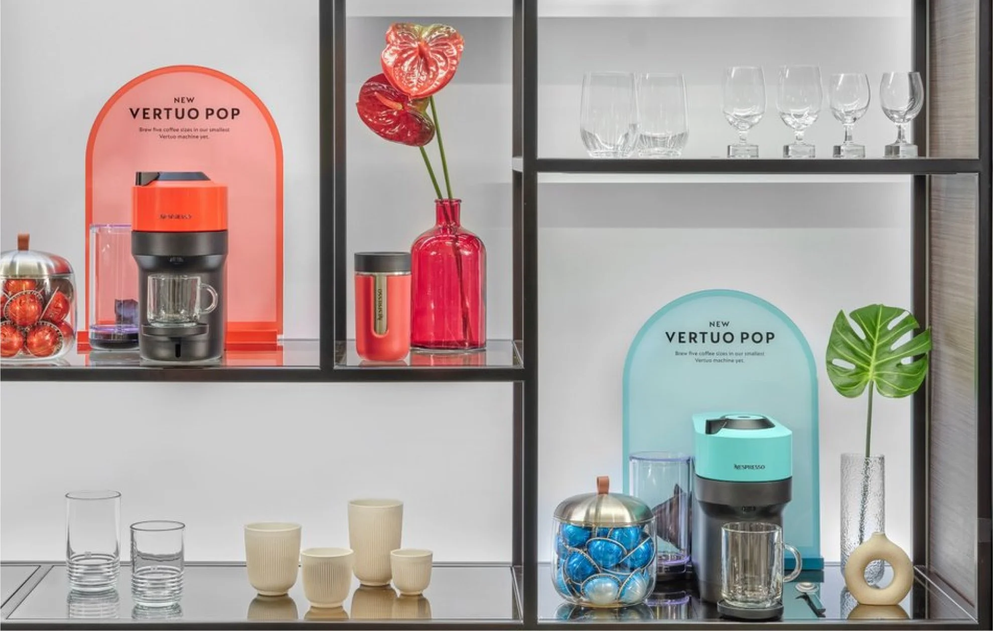
I collaborated with Nespresso on the Vertuo Pop campaign. The Nespresso Pop is a small and colorful machine capable of brewing Vertuo line capsules. As a Lead designer for this campaign, I was in charge of creating retail window designs for 23 stores across the country. As part of my responsibilities, I collaborated with my team to develop campaign concepts, worked with Nespresso to capture the essence of the campaign, and coordinated with a production company to execute the designs. We focused on developing a design concept that aims to create a personalized and colorful space, which we call a "nook", within our customers' homes. Our goal was to draw attention to the machine's environment. To achieve this, we adopted a consistent archway design that encapsulates these personalized spaces. To give you a better idea, here are some examples of the designs in the Soho Flagship store. Below are the final shots of the SoHo store showcase shelf displays, buildouts with the machine that showcases the nook, and vinyl-wrapped windows. In addition to the retail windows, we also designed the elevator, stairwell, and coffee bar.
The entire project spanned two and a half months from concept to execution, operating on an accelerated timeline that required a highly strategic and coordinated approach across multiple teams. While the centerpiece of the campaign was the vibrant in-store window installations, the initiative extended far beyond visual merchandising. We developed a comprehensive suite of assets—including digital ads, promotional videos, and printed collateral—to support the launch of the new Pop machine. Each asset was strategically crafted to communicate the product’s playful design, compact size, and range of colorways, all while reinforcing Nespresso’s premium brand positioning.
The campaign’s phased rollout continued into summer 2023, aligning with the release of new Pop machine colors and a wave of activations that extended the momentum. These included influencer collaborations, social-first content, and refreshed retail displays that kept the campaign top-of-mind and culturally relevant. Our strategic focus on experiential storytelling and consistent brand presentation paid off: the campaign drove a 30% increase in foot traffic across key retail locations and contributed to a significant lift in Pop machine sales, particularly in flagship stores where the full tasting experience and immersive vignettes were implemented. This campaign not only delivered strong performance metrics but also elevated the in-store customer experience, reinforcing Nespresso’s innovative spirit and design-forward approach.
Role: Designer and Art Director @ LPM.LA agency | Collaborators: Jules Camposano, Richard Gleason